I am back from vacation in Bavaria and Switzerland…will keep up with posting again.
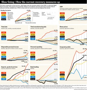
Carlos Yepez (my PhD mate at Brandeis) sent me an interesting graph that compares the current recovery to the past ones in terms of many important macro factors. The bottom line is the current recovery has been one of the worst. This is in part due to the great deleveraging – heavily indebted households, government, and big banks.
This is another graph in my category of “one graph speaks of thousand words”.
(graph courtesy of WSJ)


