

QE3 is coming – some investment strategies
It’s summer 2010, deja vu. QE2 ended in June, economy hasn’t gotten any better, and labor market remains bleak. People (including Fed Chairman Bernanke) started to talk about another round of quantitative easing. He immediately took back all his words the next day. The market gyrated.
For QE3 doubters, now look back to listen again these predictions a few months ago, for example, Marc Faber. Well, if you ask me, who am I willing to believe, Bernanke or Marc Faber? I would vouch for the latter – why should I pick someone who continues to disappoint? – the cry-wolf.
QE3 will eventually arrive, but don’t wait until the actual announcement to adjust your portfolio. Why? QE2 finally arrived in Nov. of 2010. But all the asset appreciations, including Treasuries, took off much earlier around April-May, when the speculations began to circulate. Now is your best time to reposition your portfolio.
The Fed will print more money to support bonds and treasuries. Then they will resort to inflation to pay down government debt. Chinese and Japanese will cry foul again. But as small investors, the easiest way to profit from this is to long long-term bonds, which tend to appreciate much more than their short-term cousins. Buying bonds sounds really silly when the yields are at historically low. But the bond bubble simply is not willing to pop, not yet. Everybody has been betting the yields will only go up, but what if we are headed for a long slog? And Bernanke Co. seems so willing to use whatever they have to prevent another Japan.
Okay, all these are good for bonds and bad for the dollar.
The US dollar will continue to depreciate, especially against those resource/commodity currencies, such as Brazilian Real and Australian Dollar. These currencies tend to move closely with emerging markets, which triple the growth rate in the developed world. Australian dollar surged over 50% since 2008-9 low, and as safe haven, Swiss Francs has appreciated nearly 50% – I personally felt the pinch when I traveled to the Switzerland last month. The same logic applies to gold. Gold will continue its rally. Don’t think gold is near its peak at $1,600. Wait until you see QE3.
Just a few of thoughts here. Wait until next time…
A tale of two recoveries
In 2009, there was a heated debate with regard to how strong the recovery will be. There were many guesses: L-shaped, V-shaped, you name it; the funniest one was a "root-square" recovery, meaning an initial rebound then followed by anemic growth, or the economy goes sideways. Now in hindsight, this seemingly funny root-sq analogy is probably the most accurate way to describe the current state of the recovery.
John Taylor compares the current recovery to the one after the deep recession in 1981-82. See the graph below. A real V-shaped recovery would mean GDP growth in the range of 7-8%. 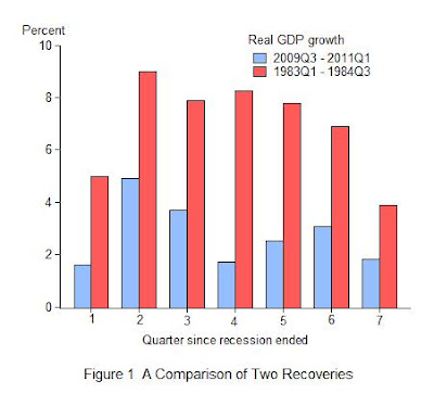
The current recession-recovery also invalidates Milton Friedman's famous hypothesis that the deeper recession is, the stronger the recovery will be — the so-called "plucking" model.
I am deeply troubled by Bernanke's recent talk that QE3 may be in the pipeline. If QE2 has no effect at all, why bother with another round of QE? This is an exciting time for economists to come up with new theories. I personally think the most promising area is to integrate financial market (esp. credit boom and bust) with the real economy. The traditional approach seems to believe there is a clear separation between the two.
Home: a lousy investment
Robert Bridges, finance-economics professor at USC, explains why:
Between 1980 and 2010, the value of a median-price, single-family house in California rose by an average of 3.6% per year—to $296,820 from $99,550, according to data from the California Association of Realtors, Freddie Mac and the U.S. Census. Even if that house was sold at the most recent market peak in 2007, the average annual price growth was just 6.61%.
So a dollar used to purchase a median-price, single-family California home in 1980 would have grown to $5.63 in 2007, and to $2.98 in 2010. The same dollar invested in the Dow Jones Industrial Index would have been worth $14.41 in 2007, and $11.49 in 2010.

Here’s another way of looking at the situation. If a disciplined investor who might have considered purchasing that median-price house in 1980 had opted instead to invest the 20% down payment of $19,910 and the normal homeownership expenses (above the cost of renting) over the years in the Dow Jones Industrial Index, the value of his portfolio in 2010 would have been $1,800,016. The stocks would have been worth more than the house by $1,503,196. If the analysis is based on 2007, the stock portfolio would have been worth $2,186,120, exceeding the house value by $1,625,850.
…
Is it wise for coming generations to continue to view ownership as the cornerstone of personal finance? Young people planning for retirement increasingly face a choice between house payments and contributions to retirement accounts. They simply can’t afford both. With the specter of looming cuts in Social Security and other entitlement programs, or even possible systemic insolvency, the challenge for tomorrow’s retirees is income self-sufficiency.
(source: WSJ)
A conversation with Alan Greenspan
Charlie Rose interviews former Fed Chairman Greenspan. He talks about the almost certainty of a Greek default, why US economic recovery has been so weak, prospect for inflation, among other things. Despite that his reputation was severely tarnished in the past few years, Greenspan offered some really good insights of the current state of the economy.

(click on the graph for the interview)
State of Recovery
I am back from vacation in Bavaria and Switzerland…will keep up with posting again.
Carlos Yepez (my PhD mate at Brandeis) sent me an interesting graph that compares the current recovery to the past ones in terms of many important macro factors. The bottom line is the current recovery has been one of the worst. This is in part due to the great deleveraging – heavily indebted households, government, and big banks.
This is another graph in my category of “one graph speaks of thousand words”.

(graph courtesy of WSJ)
Catching up with China, in Africa
US companies are catching up with China in Africa for a market that they have neglected for decades…
According to the WSJ piece,
While most U.S. companies focused international expansions on Asia and Latin America, China was leapfrogging America in Africa. China's exports to Africa last year totaled about $54 billion, up from $5.6 billion a decade before, according to the IMF. U.S. exports to Africa totaled $21 billion last year, up from $7.6 billion in 2000.
…
Western European companies, many of which had lingering business interests in Africa from colonial days, also took their eye off the ball. Western Europe's share of overall trade—the sum of imports and exports—with sub-Saharan Africa dropped to 30% in 2009 from 52% in 1990, according to McKinsey. The share of China and other Asian countries in Africa trade more than doubled to 30% from 14% in the same period, while North America's share slipped to 13% from 16%.
Jim Rogers plays US and China
The usual plain-word no-nonsense Jim Rogers:
What is dragging economic recovery?
What impedes banks from lending more widely, and what prevents businesses from hiring? It could be the uncertainty in coming regulation rules, at least that’s what Jamie Dimon fears. It’s remarkable that Jamie Dimon went public with his frustrations.
An inside analysis: